CAPE ratio, Buffett Indicator, yield curve, and economic uncertainty — what do they say about where we are right now?
There is a moment in every crisis, usually after the fact, when people say: “The signs were all there.” And they are right. The signs usually are there. The problem is not that we cannot see them. The problem is that we see them and still find reasons to look away.
I have been watching four indicators for a while now. Not because any single one of them can tell you when a crisis will arrive — none of them can. But because when you put them together, they tell a story. And right now, that story is not a comfortable one.
Let me walk through each of them. I will try to keep the language simple, because the ideas themselves are not complicated. What is complicated is what we do with them.
1) The CAPE Ratio: The Market’s Long Memory
The CAPE ratio — also called the Shiller P/E — was developed by Nobel laureate Robert Shiller and John Campbell. The idea is simple: instead of dividing the current stock price by last year’s earnings (which can be distorted by a single good or bad year), you divide it by the average of the last ten years of inflation-adjusted earnings. You smooth out the noise. You look at the long picture.
The historical average for the CAPE ratio is around 16.8. That is the number you get when you average across more than 150 years of U.S. stock market data. [¹]
Figure 1. Shiller CAPE Ratio, 1975–2026. Blue shaded areas mark major crisis periods. Source: Robert Shiller, Yale University; GuruFocus.
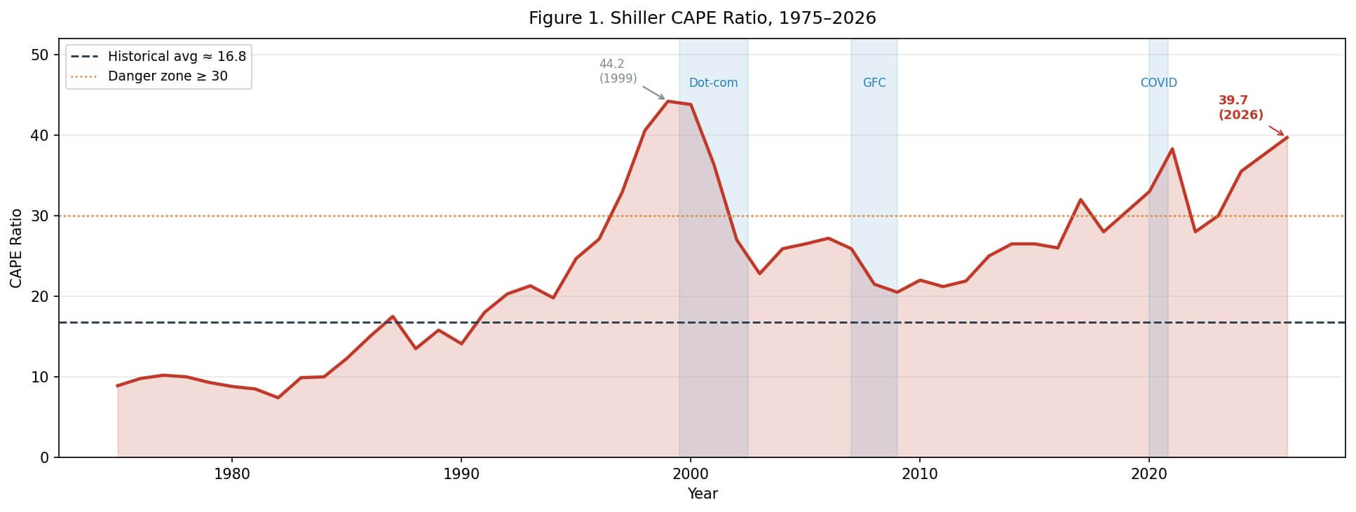
The chart above tells a clear story. The CAPE ratio has only crossed 30 twice in modern history before the current period: in 1929, just before the Great Depression, and in 1999–2000, at the peak of the dot-com bubble. In January 1997, when Shiller and Campbell first presented their findings to the Federal Reserve, the ratio was at 28 — and they warned that the real value of the market could be 40% lower in ten years. That forecast turned out to be remarkably accurate. [²]
As of February 2026, the CAPE ratio stands at approximately 39.7. [³]
That is 44% above the recent 20-year average of 27.4. It is more than double the long-run historical average. And it puts us in the same territory as the dot-com peak — the only time in the last century when valuations were this stretched.
Now, I want to be careful here. The CAPE ratio is not a timing tool. It does not tell you that the market will crash next month or next year. What it tells you is something more like a probability statement: at these valuation levels, the expected real return over the next 10–20 years is historically very low. GuruFocus currently estimates the implied future annual return at around 1.6%. [³]
That is not a crash prediction. That is a quiet warning.
2) The Buffett Indicator: The Big Picture
Warren Buffett once called the ratio of total stock market capitalization to GDP “probably the best single measure of where valuations stand at any given moment.” [⁴] The name stuck.
The logic is intuitive. The stock market is supposed to represent the productive capacity of the economy. If the market grows much faster than the economy itself, at some point the gap has to close — either through earnings catching up, or through prices coming down.
Figure 2. Buffett Indicator (Total Market Cap / GDP), 1975–2026. Source: Wilshire Associates; U.S. Bureau of Economic Analysis; GuruFocus.
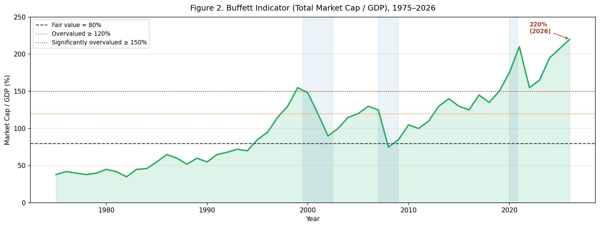
The reference levels that most analysts use are roughly these:
| Level | Interpretation |
| Below 80% | Undervalued — historically good entry point |
| 80–100% | Fair value range |
| 100–120% | Moderately overvalued |
| Above 150% | Significantly overvalued |
| Above 200% | Extreme territory |
In 2000, at the peak of the dot-com bubble, the Buffett Indicator reached approximately 148%. In 2007, just before the global financial crisis, it was around 125–130%. Both of those levels were considered alarming at the time.
As of early 2026, the Buffett Indicator is estimated at approximately 220%. [⁵]
That is not a typo. The total market capitalization of U.S. equities is more than twice the size of the entire U.S. economy. This is a level that has no historical precedent in the post-war era.
Some analysts argue that this comparison is less meaningful today because of globalization — U.S. companies earn a large share of their revenues abroad, so comparing them only to U.S. GDP understates their earnings base. That is a fair point. But even adjusting for this, the current level is extraordinary.
3) The Yield Curve: The Bond Market’s Quiet Warning
The yield curve is one of those things that sounds technical but is actually quite simple. It is just the difference between long-term and short-term interest rates. Normally, you expect to earn more for lending money for ten years than for two years — because you are taking more risk, more uncertainty. So normally, the yield curve slopes upward.
When it inverts — when short-term rates are higher than long-term rates — something unusual is happening. It usually means that bond markets expect the economy to slow down, that the central bank will eventually have to cut rates, and that the future looks less certain than the present.
Figure 3. U.S. Yield Curve Spread (10-Year minus 2-Year Treasury), 1976–2026. Red bars indicate inversion. Source: U.S. Federal Reserve; FRED.
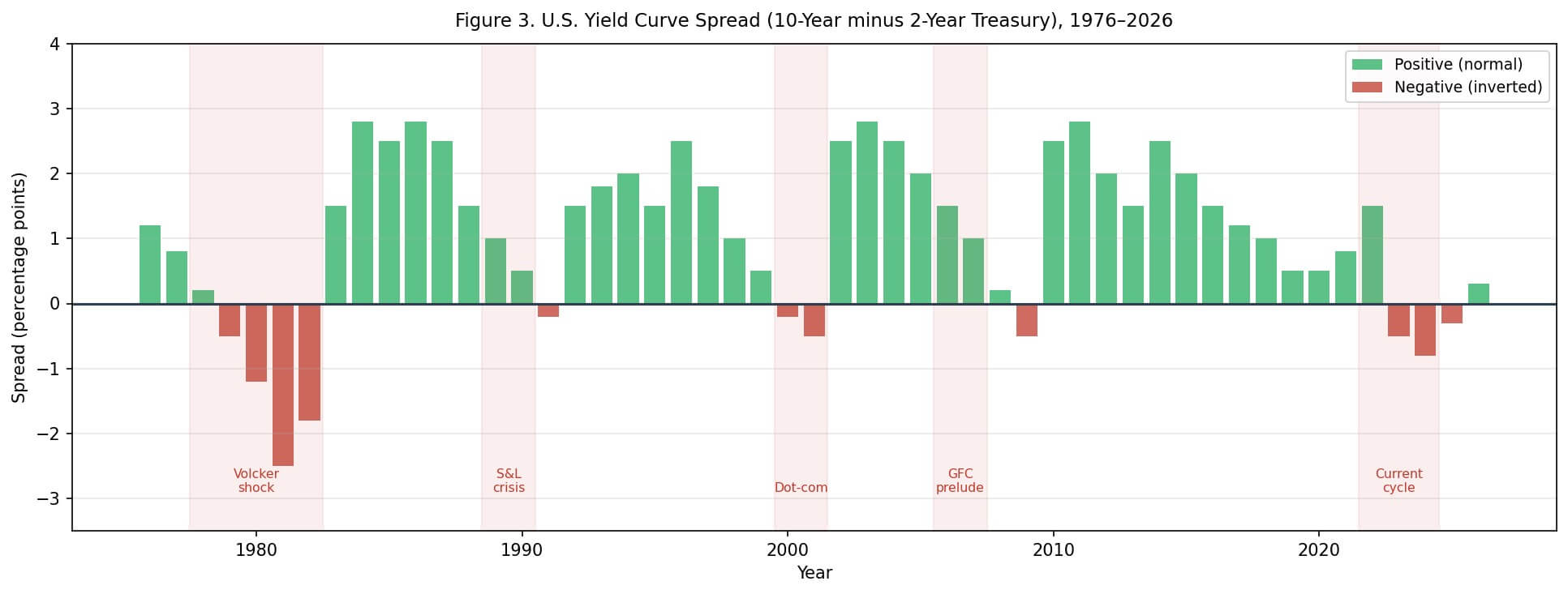
The historical record here is striking. Since 1976, every single U.S. recession has been preceded by a yield curve inversion. Not most of them. Every one of them. [⁶] The lag between inversion and recession has varied — sometimes 6 months, sometimes 18–24 months — but the signal has never been wrong in the direction.
The current cycle has been particularly notable. The 10-year minus 2-year spread turned negative in mid-2022 and remained inverted for an unusually long period — one of the deepest and most sustained inversions in modern history. As of early 2026, the curve has begun to “re-steepen,” which historically can actually be a more immediate warning sign: the curve often steepens just as a recession begins, because short-term rates start to fall in anticipation of Fed cuts.
The table below summarizes the historical pattern:
| Inversion Period | Recession That Followed | Lag (approx.) |
| 1978–1980 | 1980 recession | ~6 months |
| 1980–1982 | 1981–82 recession | ~12 months |
| 1988–1989 | 1990–91 recession | ~18 months |
| 2000 | 2001 recession | ~12 months |
| 2006–2007 | 2008–09 GFC | ~18 months |
| 2019 (brief) | 2020 COVID recession | ~8 months |
| 2022–2024 | ? | Ongoing |
Source: Federal Reserve Bank of St. Louis (FRED); NBER recession dates.
The question mark in the last row is honest. We do not know yet. But the pattern is there.
4) Economic Policy Uncertainty: The Noise That Becomes Signal
The Economic Policy Uncertainty (EPU) Index was developed by economists Scott Baker, Nicholas Bloom, and Steven Davis. [⁷] It measures uncertainty by combining three things: newspaper coverage of economic policy uncertainty, the number of tax code provisions set to expire, and disagreement among economic forecasters. It is not a perfect measure, but it is a useful one.
Figure 4. Economic Policy Uncertainty Index (EPU), 1985–2026. Source: Baker, Bloom & Davis; policyuncertainty.com.
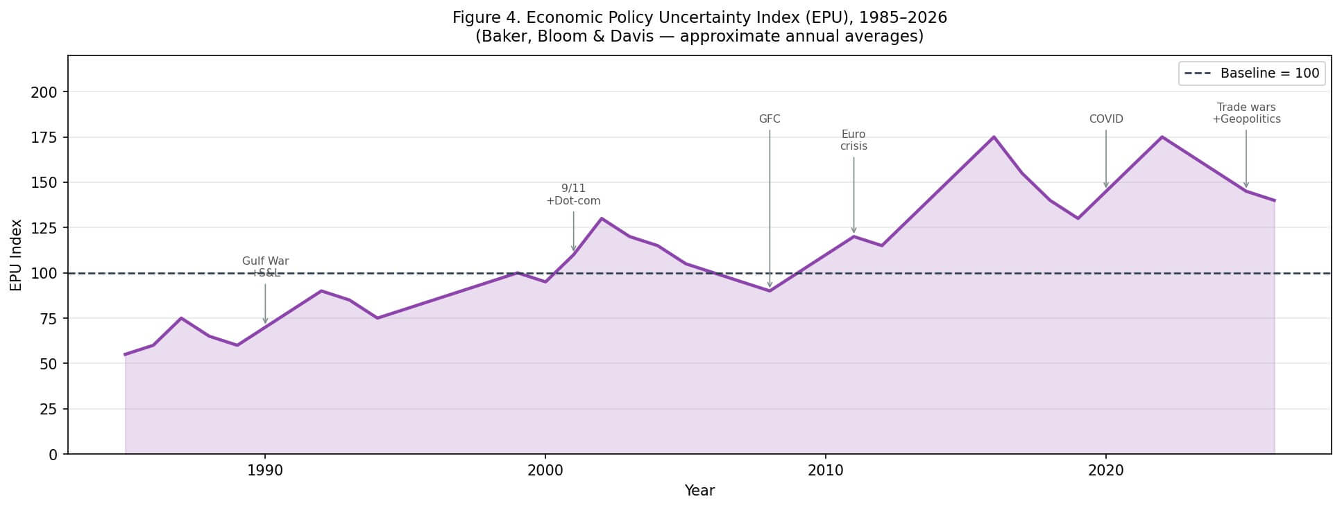
What the chart shows is a pattern that repeats: uncertainty spikes during crises (Gulf War, 9/11, GFC, COVID), then gradually subsides — but rarely returns to pre-crisis lows. Each cycle seems to leave a slightly higher floor.
The current period is interesting. We are not at the extreme spikes of 2008 or 2020. But we are well above the calm periods of the mid-1990s or mid-2000s. Trade policy uncertainty, geopolitical tensions, questions about central bank independence, and the structural disruptions from AI and technology are all contributing to a background level of uncertainty that is not going away.
This matters because uncertainty itself has economic costs. When businesses and households are uncertain, they delay investment and spending decisions. That delay can become self-fulfilling.
5) What Happens to These Indicators Before, During, and After a Crisis?
Let me put the historical pattern in one place. This is not a prediction table. It is a pattern recognition exercise.
| Indicator | Pre-Crisis | During Crisis | Post-Crisis Recovery |
| CAPE Ratio | Elevated, often above 25–30 | Falls sharply as prices drop | Slowly normalizes; sometimes stays elevated |
| Buffett Indicator | Above 120–150% | Drops as market falls faster than GDP | Gradual recovery; post-2009 never returned to “fair value” |
| Yield Curve | Inverted or inverting | Often re-steepens as recession begins | Returns to normal slope as rates are cut |
| EPU Index | Rising, elevated | Spikes to extreme levels | Gradual decline, but floor rises over time |
Source: Author’s compilation from FRED, Yale Shiller data, Baker-Bloom-Davis EPU database, GuruFocus.
The pattern is consistent across the major crises of the last 50 years. The 1973–74 oil shock, the 1980–82 Volcker recession, the 1987 crash, the dot-com collapse, the 2008 global financial crisis, and the COVID shock all show variations of the same sequence: valuations stretch, the yield curve inverts, uncertainty rises, and then something breaks.
What breaks is different each time. In 2000 it was technology valuations. In 2008 it was the housing and credit system. In 2020 it was a pandemic. The trigger is always a surprise. The vulnerability is always visible in advance.
6) So Where Are We Now?
Let me be direct about what the data says, and equally direct about what it does not say.
What the data says:
The CAPE ratio at 39.7 is in the top 2% of all historical readings. The Buffett Indicator at 220% has no modern precedent. The yield curve has been inverted for an unusually long period and is now re-steepening. The EPU index is elevated and structurally higher than the calm periods of the 1990s.
Every single one of these indicators is in the zone that, historically, has preceded significant market corrections or recessions. Not some of them. All of them. At the same time.
What the data does not say:
It does not say when. It does not say what the trigger will be. And it does not say that this time cannot be different — though that phrase, “this time is different,” has a long and unfortunate history in financial markets.
John Templeton, one of the great investors of the 20th century, called “this time is different” the four most dangerous words in investing. [⁸] I think he was right. Not because things never change, but because the people who say it are usually the ones who have the most to lose from admitting that they do not.
A Note on What These Indicators Cannot Do
I want to end with something that I think is important.
These indicators are not crystal balls. The CAPE ratio was elevated for years before the dot-com crash. The Buffett Indicator was above “fair value” for most of the 2010s without a major correction. The yield curve can stay inverted longer than anyone expects.
What they give you is not a prediction. What they give you is a map of the terrain. And right now, the terrain looks like the kind of place where you want to watch your step.
The question is not whether a crisis is coming. Crises always come. The question is whether the system is resilient enough to absorb the next shock — whatever it turns out to be — or whether the combination of stretched valuations, inverted credit signals, and elevated uncertainty means that the next shock will find a system that is already fragile.
Looking at the dashboard right now, I would say: the lights are on. Not all of them, and not at maximum brightness. But enough of them, and for long enough, that it would be unwise to pretend they are not there.
Financial Literacy: Understanding Key Financial Terms
In this section, I aim to clarify some essential financial terms for readers who may be unfamiliar with them. These definitions are provided with simple explanations and examples to enhance understanding.
- Put Option:
A put option is a financial contract that gives the holder the right, but not the obligation, to sell an asset at a specified price (called the strike price) within a certain time period. For example, if you own a put option on a stock with a strike price of $50, and the stock price falls to $40, you can sell the stock at $50, thus limiting your loss. - Call Option:
A call option is a financial contract that gives the holder the right, but not the obligation, to buy an asset at a specified price within a certain time period. For instance, if you have a call option on a stock with a strike price of $100, and the stock price rises to $120, you can buy the stock at $100, making a profit. - Future Contracts:
A futures contract is an agreement to buy or sell an asset at a predetermined price at a specified time in the future. Unlike options, futures obligate the buyer to purchase, and the seller to sell, the asset at the agreed price on the contract date. For example, a farmer might enter a futures contract to sell wheat at $5 per bushel in three months, locking in the price regardless of market fluctuations.
These financial instruments are widely used for hedging risks or speculating on price movements in various markets.
Disclaimer
This text is for informational and educational purposes only. It is not investment advice. All data is taken from publicly available sources as cited below. Readers should verify series definitions and dates when using the numbers for their own analysis.
References & Data Sources
[1] Shiller, R.J. (2000). Irrational Exuberance. Princeton University Press. Data: econ.yale.edu/~shiller/data.htm
[2] Campbell, J.Y. & Shiller, R.J. (1998). “Valuation Ratios and the Long-Run Stock Market Outlook.” Journal of Portfolio Management, 24(2), 11–26.
[3] GuruFocus. Shiller PE Ratio. Accessed February 2026. gurufocus.com/shiller-PE.php
[4] Buffett, W. (2001). “Warren Buffett on the Stock Market.” Fortune Magazine, December 10, 2001.
[5] GuruFocus. Buffett Indicator. Accessed February 2026. gurufocus.com/indicator/buffett
[6] Federal Reserve Bank of St. Louis. FRED. Series: T10Y2Y (10-Year Treasury Constant Maturity Minus 2-Year), USREC. fred.stlouisfed.org
[7] Baker, S.R., Bloom, N. & Davis, S.J. (2016). “Measuring Economic Policy Uncertainty.” Quarterly Journal of Economics, 131(4), 1593–1636. Data: policyuncertainty.com
[8] Templeton, J. (various). Widely attributed; see: Marks, H. (2011). The Most Important Thing. Columbia University Press.